
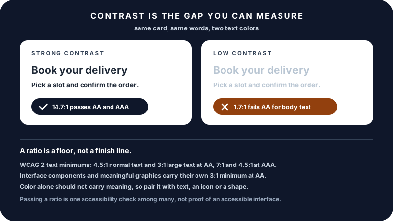
Color contrast is the most measurable factor in whether text is readable. The Web Content Accessibility Guidelines (WCAG) define a numerical ratio between a foreground color and the background behind it, with different thresholds depending on the conformance level you are targeting, the size of the text, and whether the thing being measured is text at all.
Every threshold in this guide comes from WCAG 2.x (versions 2.0, 2.1, and 2.2, which share the same contrast success criteria). Meeting them removes a real and common barrier for readers with low vision, for anyone on a glary screen, and for tired eyes generally. Meeting them does not, on its own, make an interface accessible: contrast is one measurable criterion among many.
Key Takeaways
- Contrast ratio compares the relative luminance of two colors, ranging from 1:1 (no contrast) to 21:1 (black on white).
- Text at WCAG 2.x level AA needs 4.5:1 for normal text and 3:1 for large text.
- Text at level AAA needs 7:1 for normal text and 4.5:1 for large text.
- "Large text" means 18pt or larger, or 14pt bold or larger.
- Non-text contrast is a separate rule. User interface components and meaningful graphics need 3:1 at level AA. There is no AAA equivalent for non-text contrast.
- Some things are exempt from the text rule, including logotypes and text that is part of an inactive component or purely decorative.
- A passing ratio is a floor, not a finish line. It does not test hue confusion, focus order, labelling, or anything else.
How Contrast Is Calculated
The WCAG contrast formula compares the relative luminance of two colors:
Contrast Ratio = (L1 + 0.05) / (L2 + 0.05)
Where L1 is the luminance of the lighter color and L2 is the luminance of the darker color. Relative luminance is not simply the average of the RGB values. Each channel is first scaled to the range 0 to 1, then linearized to undo the gamma encoding that sRGB applies, and only then combined:
L = 0.2126 × R + 0.7152 × G + 0.0722 × B
where R, G, and B are the linearized channel values, not the raw 0 to 255 numbers. Skipping the linearization step is why hand-rolled contrast scripts often disagree with a proper checker.
The weights reflect how the human eye perceives each color: green appears brighter than blue at the same intensity, which is why green has the largest weight. The + 0.05 on both sides of the ratio models a small amount of ambient screen flare, and it is what caps the scale at 21:1 instead of letting it run to infinity against pure black.
You almost never need to calculate this by hand. Every modern design tool and accessibility checker does it automatically.
The Contrast Scale
Contrast ratios range from 1:1 to 21:1:
| Ratio | Example | Readability |
|---|---|---|
| 1:1 | Same color | Invisible |
| 1.5:1 | Very subtle | Decorative only |
| 3:1 | Minimum for large text (AA) | Borderline |
| 4.5:1 | AA for normal text | Generally readable |
| 7:1 | AAA for normal text | Strong contrast |
| 12:1+ | Strong contrast | Easy to read |
| 21:1 | Black on white | Maximum contrast |
A good rule of thumb: if you have to squint to read it, the contrast is probably too low.
WCAG Levels Explained
WCAG defines three conformance levels: A (basic), AA (standard), and AAA (enhanced). For contrast specifically:
Level AA:
- 4.5:1 for normal text
- 3:1 for large text (18pt or larger, or 14pt bold or larger)
- 3:1 for user interface components and meaningful graphics, under a separate success criterion added in WCAG 2.1
Level AAA (enhanced):
- 7:1 for normal text
- 4.5:1 for large text
- no non-text contrast requirement at this level
Two distinctions are worth holding onto. The text thresholds and the non-text threshold are different success criteria with different scopes: one covers characters you read, the other covers things like the border of an input field, the outline of a focus ring, or a chart line whose color carries the meaning. And the text rule carries exemptions: logotypes, text in an inactive user interface component, and text that is purely decorative are not held to the ratio.
Most regulatory frameworks (Section 508 in the United States, EN 301 549 in Europe, the European Accessibility Act) reference AA as the baseline. AAA is encouraged but rarely mandated wholesale. For text-heavy reading interfaces, AAA meaningfully improves the experience for low-vision users.
What Counts as "Large Text"?
WCAG defines large text as:
- 18pt or larger, which is 24px in CSS at the default scale
- or 14pt bold or larger, which is about 18.7px bold in CSS and is often written as 19px
The reasoning: larger and bolder characters are inherently easier to read, so they need less contrast to meet the same readability threshold.
Worked Examples
Black on white: #000000 on #FFFFFF → contrast ratio 21:1. Maximum possible. Passes everything.
Dark gray on white: #333333 on #FFFFFF → 12.6:1. Comfortable, passes AAA.
Medium gray on white: #666666 on #FFFFFF → 5.7:1. Passes AA, fails AAA for normal text.
Light gray on white: #999999 on #FFFFFF → 2.85:1. Fails AA. Common placeholder text that is too light.
Light blue on white: #7DD3FC on #FFFFFF → 1.67:1. Fails every text threshold, though it is fine as a decorative fill.
Blue on white: #2563EB on #FFFFFF → 5.17:1. Passes AA for normal text, fails AAA.
A frequent mistake: using lighter text on white because it "looks nicer," then failing AA. Color choices that look elegant in a Figma file may be unreadable for users with mild visual impairment.
Real-World Failure Modes
The most common contrast failures:
- Placeholder text in form fields. Often gray on white, frequently failing AA.
- Disabled state text. WCAG 2.x does exempt text in an inactive component from the contrast rule, so a greyed-out control is not automatically a failure. That is a compliance answer, not a usability one: if nobody can read what the disabled button says, nobody can tell what will happen once it becomes active.
- Light text on light backgrounds. White on light blue, light gray on lighter gray.
- Branded color on white. Many brand colors are vivid but mid-luminance, passing for large text but failing for body text.
- Text over images. Without an overlay, contrast varies pixel by pixel and often fails most of the image area.
- Hover and focus states. Easy to forget; need their own contrast check.
Designing for Contrast
A few practical rules:
Test the brand color against your background. If it fails AA, use it for accents, large text, or graphics, not body text.
Build a tonal palette. Take a base color and generate 9 shades (varying lightness). The darker shades work as text colors on light backgrounds; the lighter shades work as backgrounds for dark text.
Use sufficient luminance gap. A 30-point lightness gap in HSL usually produces passable contrast, though the exact ratio depends on hue and saturation.
Layer with overlays. When placing text over images, add a semi-transparent dark overlay (e.g., rgba(0, 0, 0, 0.4)) to standardize the background luminance.
Don't rely on color alone. Commonly cited estimates put color vision deficiency at roughly 8% of men and 0.5% of women of Northern European ancestry, with rates varying by population. Pair color cues with icons, labels, or shapes. WCAG's "use of color" success criterion is a separate requirement from contrast, and a design can pass every ratio while still failing it.
Check Contrast While You Design, Not After
Contrast failures found at the end of a project are expensive in a way that has nothing to do with difficulty. The ratio itself takes seconds to fix. What costs time is that a failing color is rarely used once: it is in the design file, the token set, the component library, the marketing site, and three screenshots in the documentation. Changing it late means changing all of them and re-reviewing everything it touched.
Caught during design, the same fix is a single decision about a palette value. Three habits make that the normal case:
- Test the palette, not the page. Check each text color against each background it is allowed to sit on, once, and record the results. Every later screen inherits an answer instead of needing a fresh check.
- Check the states when you design the states. Hover, focus, active, disabled, error, and placeholder each have their own colors and each need their own number.
- Keep a checker open beside the design tool. It removes the temptation to eyeball it, which is the step where "that looks fine to me" quietly enters the project.
Common Mistakes
Testing only the marketing page. Errors usually live in forms, modals, secondary navigation, and edge-state UI.
Forgetting state variations. Hover, focus, active, disabled: each combination needs its own check.
Ignoring brand color for body text. Brand colors are often chosen for vibrancy, not legibility. Use a darker variant for body copy.
Relying on screen capture comparisons. Visual judgment is unreliable; use a contrast checker for the exact ratio.
Treating AAA as overkill. For long-form reading or critical content, AAA is genuinely better, not just stricter.
Confusing contrast with color blindness. Contrast helps everyone; color blindness simulation tests specifically for hue confusion. Both matter, separately.
Color Blindness Considerations
Roughly 1 in 12 men and 1 in 200 women are commonly estimated to have some form of color vision deficiency, with prevalence varying by population. The main types:
- Deuteranomaly and deuteranopia: reduced or absent green sensitivity. The most common group.
- Protanomaly and protanopia: reduced or absent red sensitivity.
- Tritanomaly and tritanopia: reduced or absent blue sensitivity. Rare.
Red-green color blindness is by far the most common. UI elements using red and green together (status indicators, validation states) are the most affected.
Fixes:
- Use different shapes/icons alongside color
- Use blue and orange instead of red and green for two-state distinctions
- Test with a color blindness simulator (browser plugins available)
Contrast ratio compliance helps but does not solve color blindness; they are separate accessibility concerns.
Practical Scenarios
Scenario 1: Brand color check. A brand specifies #7C3AED (vibrant purple). Against white: 5.70:1, passing AA for normal text and failing AAA. Against a light gray #F3F4F6 background: 5.18:1. Worth noting how much a slightly tinted background costs you.
Scenario 2: Dark mode design. White text #FFFFFF on dark background #111827: 17.74:1. Pure white is sometimes too harsh for long reading; #E5E7EB on the same background gives 14.33:1, still far above AAA but slightly softer.
Scenario 3: Form placeholder. A common placeholder gray #9CA3AF on white is 2.54:1, well below AA. Replacing it with #6B7280 gives 4.83:1, which clears the 4.5:1 threshold for normal text.
Scenario 4: Status indicator. Red for "error" and green for "success" at similar lightness can each pass a contrast check and still be hard to tell apart for someone with red-green color vision deficiency. Add an icon or a shape so the color is redundant rather than the only signal, and prefer a pair that differs in lightness as well as hue.
Scenario 5: Focus ring. A focus indicator is a user interface component, so the relevant threshold is the 3:1 non-text minimum at AA, measured against whatever sits next to it. A 2px ring at 1.5:1 against the page background has a visible shape and still fails the criterion.
FAQ
What is a contrast ratio? A number describing the difference in relative luminance between two colors, ranging from 1:1 (identical) to 21:1 (black on white). Higher means more contrast.
What contrast ratio is required for accessibility? WCAG AA requires 4.5:1 for normal text and 3:1 for large text. AAA requires 7:1 and 4.5:1 respectively.
What is considered "large text" in WCAG? 18pt or larger (about 24px), or 14pt bold (about 19px bold). Larger characters need less contrast to be readable.
Does contrast ratio depend on the color format? No. Whether you specify a color in HEX, RGB, or HSL, the rendered pixel is the same, so the contrast ratio is identical.
Is AAA always better than AA? For text-heavy interfaces and critical content, yes. AAA can be hard to achieve with branded color palettes; AA is the practical baseline for most websites.
How does color blindness relate to contrast? They are related but distinct. Good contrast helps with low vision and lighting issues. Color blindness requires designs that don't depend on hue alone; pair color with shape, label, or icon.
Does a passing contrast ratio mean my interface is accessible? No. It means one measurable barrier has been removed. Contrast says nothing about keyboard operability, focus order, form labelling, heading structure, alternative text, motion, or whether color is the only carrier of meaning. Treat the ratio as a floor to clear early, not a certificate.
Where can I check contrast? Online contrast checkers, browser DevTools in Chrome and Firefox, Figma plugins, and the Color Contrast Checker all compute the ratio from any two colors instantly.
Related Tools
The Color Contrast Checker evaluates any text and background pair against the WCAG AA and AAA thresholds. When you need the same color in another notation, the Color Code Converter moves between HEX, RGB, HSL, and HSV, and the Color Picker is the quicker route while you are still choosing the shade rather than checking one.
Related Articles
Final Thoughts
Color contrast is the rare accessibility concern with a single, measurable, objective answer. For a given pair of colors and a given threshold, either the ratio clears it or it doesn't. That makes it one of the easiest accessibility wins available, and it benefits everyone, not just users with disabilities. It is also why contrast gets over-trusted: clearing a number is satisfying in a way the harder, less countable parts of accessibility are not, and a page can pass every ratio on it and still be unusable with a keyboard or a screen reader. Glare on a phone screen, eyes tired at the end of a workday, a parent reading on the train: anyone reading text under non-ideal conditions benefits from designs that meet WCAG. Spend the five minutes to run your colors through a checker. The improvement compounds across every user, every page, every visit.