
A layout can look calm on a desktop and awkward on a phone without any single rule being obviously wrong. The heading is too large. The card padding feels heavy. A button wraps in a strange place. The design was not broken exactly; the units were too rigid for the range of screens and user settings it had to survive.
CSS units decide how sizes respond to context. Pixels, rems, ems, viewport units, and percentages each answer a different question. Good responsive design is not about replacing every px with rem. It is about choosing the unit that matches the job, and knowing the handful of rules that behave differently from the way most people assume.
BlinkCalc's Pixel Converter helps convert px, rem, em, pt, vw, and vh values, but the real value comes from knowing why you would choose one unit over another.
What px means
px stands for CSS pixel. It is the most familiar unit because it feels concrete:
.button {
  padding: 12px 16px;
  border-radius: 8px;
}
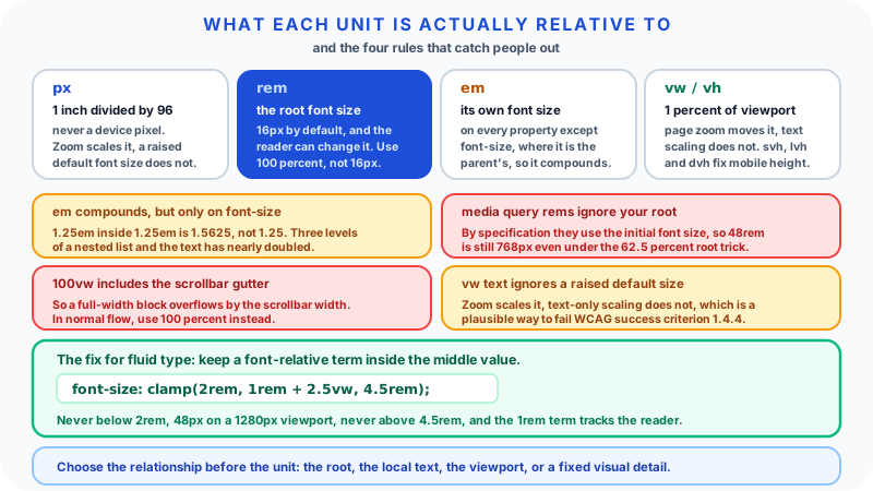
A CSS pixel is not a device pixel. In CSS the relationship runs the other way around: 1px is defined as exactly 1in / 96, so all the absolute units are anchored to each other, and the browser decides how many physical dots that becomes. On a high density phone screen one CSS pixel may be drawn with two or three device pixels; at 200% browser zoom it covers twice the area it did before. That is why px stays a stable design unit even though it is a poor description of hardware.
Pixels are useful for:
- Borders
- Hairline dividers
- Icon sizes
- Small fixed gaps
- Canvas measurements
- Precise visual details
Pixels are less flexible for body text and large layout spacing because they do not respond to a user's font-size preference. Browser zoom still scales them, but a reader who has raised the default text size in their browser settings, without zooming, sees pixel-sized text stay exactly where it was.
What rem means
rem means root em. It is the computed font-size of the root element, normally <html>. Browsers ship a default of font-size: medium, which resolves to 16px in every current desktop browser, but users can change it in browser settings and some do.
If the root resolves to 16px:
| rem | px equivalent |
|---|---|
| 0.5rem | 8px |
| 0.75rem | 12px |
| 1rem | 16px |
| 1.5rem | 24px |
| 2rem | 32px |
This makes rem useful for typography and spacing systems:
html {
  font-size: 100%;
}

.article-title {
  font-size: 2rem;
  margin-bottom: 1rem;
}
font-size: 100% is deliberate. It inherits whatever the user's preference is instead of overwriting it. Setting html { font-size: 16px } looks equivalent and is not: it pins the root to 16px and quietly discards the reader's setting, so every rem in the system stops honouring it.
You will also meet the "62.5% trick", where the root is set to 62.5% so that 1rem equals 10px and conversion becomes mental arithmetic. It keeps the user's preference proportionally (a reader on a 20px default gets a 12.5px root), but it makes every inherited default, including form controls and any third-party widget that assumes a 16px root, render smaller than intended. If you use it, set the body back to 1.6rem and test with a raised browser default.
One subtlety worth knowing: inside a declaration on the root element itself, rem refers to the root's initial value rather than the value being set, so html { font-size: 1.5rem } resolves against the browser default rather than recursing.
What em means
em is relative to a computed font size, but which one depends on where you use it, and this is the single most common source of surprise.
- On any property other than
font-size,1emis the element's own computed font size. - On the
font-sizeproperty itself,1emis the font size inherited from the parent.
That difference is what makes the following work:
.badge {
  font-size: 0.875rem;
  padding: 0.4em 0.7em;
}
The padding resolves against the badge's own 0.875rem text, so it is 0.35rem and 0.6125rem. If a compact variant changes the badge's font size, the padding follows automatically. That is exactly what you want for components where breathing room should track the text inside.
The surprise appears with nesting on font-size. If a parent sets font-size: 1.25em and a child sets font-size: 1.25em, the child compounds to 1.5625 times the grandparent size, because each one resolves against its parent. Three levels of a nested list and text is nearly double. That can be useful in a controlled component and is a menace in user-generated content.
Use em when local scaling is the goal. Use rem when you want consistency from the root.
What vw and vh mean
vw means viewport width. vh means viewport height. One vw is 1% of the viewport width, and one vh is 1% of the viewport height, measured against the initial containing block.
.hero {
  min-height: 70vh;
  padding-inline: 6vw;
}
Viewport units are useful for layout areas that should relate to the browser window: full-screen sections, fluid spacing, and responsive media frames.
Two traps are worth naming.
100vw includes the classic scrollbar. On a desktop browser that reserves a gutter for a vertical scrollbar, the viewport width used by vw is the full window width, while the content area is narrower. A width: 100vw element therefore overflows by the scrollbar width and produces a horizontal scrollbar of its own. For a full-width block inside normal flow, width: 100% is almost always the right answer.
Text sized in vw does not respond to text-only scaling. Browser page zoom changes the viewport size, so vw-based text does grow. But a reader who raises only the default font size, without zooming, sees vw text stay exactly where it was. That is a plausible way to fail WCAG success criterion 1.4.4, which asks that text can be resized to 200% without loss of content or functionality. The fix is not to abandon viewport units but to keep a font-relative term in the mix:
.headline {
  font-size: clamp(2rem, 1rem + 2.5vw, 4.5rem);
}
That says: never below 2rem, never above 4.5rem, and in between grow from a 1rem base at 2.5% of viewport width. On a 1280px viewport the preferred value is 16 + 32, which is 48px. Because the middle term contains 1rem, a raised default font size still moves it.
svh, lvh, and dvh
Classic vh on mobile is measured against the large viewport, the one you get when the browser's address bar has retracted. So 100vh is taller than the visible area while the bar is showing, and a "full screen" panel gets clipped at the bottom.
The viewport unit variants fix this and have shipped across Chrome, Safari, and Firefox since 2022:
svhis 1% of the small viewport, the shortest state with all browser interfaces expanded. A100svhpanel always fits.lvhis 1% of the large viewport, matching classicvh.dvhis 1% of the dynamic viewport, which tracks the interfaces as they appear and retract.
dvh is the most accurate and the least calm: because it changes as the user scrolls and the address bar moves, any layout that depends on it reflows during the animation. For a hero or a modal that must never clip, 100svh is usually the safer default, with dvh reserved for elements where the exact fit genuinely matters.
Absolute vs relative units
Pixels are often described as absolute. Rem, em, vw, vh, and percentages are relative. The distinction is practical rather than moral. Absolute units are predictable. Relative units adapt.
Good interfaces usually use both:
| Use case | Often suitable |
|---|---|
| Body font size | rem |
| Component padding | rem or em |
| Border width | px |
| Icon size | px, rem, or em |
| Page max width | rem, px, or ch |
| Full-height panel | svh, or dvh where exact fit matters |
| Fluid hero spacing | clamp with rem plus vw |
| Rounded corners | px or rem |
The unit should express the relationship you want. If spacing should grow with text, use relative text-based units. If a border should remain a thin line, px is fine.
Typography and accessibility
Typography is where unit choices become noticeable. Fixed pixel text ignores a raised default font size, though browser zoom still scales it. Rem-based type is tied to the root font size and honours both.
A practical type scale might look like:
:root {
  font-size: 100%;
}

body {
  font-size: 1rem;
  line-height: 1.6;
}

h1 {
  font-size: clamp(2rem, 1rem + 3vw, 3.5rem);
  line-height: 1.1;
}
The body uses rem, while the heading uses a bounded fluid value with a rem term inside it, so it can respond to viewport width without becoming unlimited and without ignoring the reader's setting.
Accessibility is not only unit choice. Two WCAG 2.2 criteria are worth testing against directly:
- 1.4.4 Resize Text (AA): text can be resized up to 200% without loss of content or functionality.
- 1.4.10 Reflow (AA): content works at a width equivalent to 320 CSS pixels without requiring scrolling in two dimensions, which in practice means testing a 1280px window at 400% zoom.
A rem-based layout can still fail both if containers have fixed heights, hidden overflow, or a min-width wider than the space available.
Spacing systems
Spacing systems keep designs consistent. A common approach is to define spacing tokens based on rem:
:root {
  --space-1: 0.25rem;
  --space-2: 0.5rem;
  --space-3: 0.75rem;
  --space-4: 1rem;
  --space-6: 1.5rem;
  --space-8: 2rem;
}
Then components use tokens instead of random values:
.card {
  padding: var(--space-6);
  gap: var(--space-4);
}
This is easier to maintain than mixing 13px, 22px, and 37px across a codebase. It also helps design and development teams speak the same sizing language.
Pixels still have a place. A 1px border, 2px focus outline, or 8px radius may be perfectly reasonable. Consistency matters more than pretending one unit solves everything.
Choosing units by component
The easiest way to choose units is to think about the component's behaviour.
| Component part | Sensible unit choice | Reason |
|---|---|---|
| Body copy | rem | Follows the root text scale |
| Button padding | em | Scales with the label |
| Icon inside text | em | Matches surrounding text size |
| Card max width | rem or ch | Keeps readable line length |
| Divider border | px | Should stay visually thin |
| Hero spacing | clamp with rem and vw | Fluid but bounded |
| Modal height | svh or dvh with limits | Relates to available screen space |
This is a decision aid, not a rigid table. A design system may choose rem for icon sizes to keep all icons on a consistent scale. Another may use em so icons grow with button text. Either can work if the rule is intentional and tested.
Problems appear when a component mixes units without a reason. A card with font-size: 14px, padding: 1.375rem, gap: 9px, and a fixed height: 180px is hard to maintain because each value responds to something different.
Responsive design examples
Consider a card grid. On desktop, each card has room for generous padding. On mobile, the same padding crowds the content.
.card {
  padding: clamp(1rem, 2vw, 1.5rem);
  border-radius: 0.75rem;
}
The padding moves between 1rem and 1.5rem based on viewport width. It will not shrink into nothing or grow wildly.
For a button with text and an icon:
.button {
  font-size: 1rem;
  padding: 0.65em 1em;
  gap: 0.5em;
}
The padding and gap follow the button's own font size. If a compact variant changes that font size, the surrounding space adjusts proportionally.
For a full-screen layout:
.panel {
  min-height: 100svh;
}
Using svh rather than vh means the panel fits the shortest state of the mobile viewport, so nothing is clipped while the address bar is showing.
Breakpoints and fluid values
Breakpoints are still useful. Fluid units do not remove the need to change layout when the available space changes. A three-column desktop grid may need to become two columns, then one. No unit conversion makes three cramped columns readable on a narrow screen.
Use units and breakpoints together:
.cards {
  display: grid;
  gap: clamp(1rem, 2vw, 1.5rem);
  grid-template-columns: repeat(3, minmax(0, 1fr));
}

@media (max-width: 48rem) {
  .cards {
    grid-template-columns: 1fr;
  }
}
The gap changes fluidly, while the layout changes at a deliberate breakpoint.
There is a rule here that catches almost everyone. Relative units inside a media query do not use your root font size. The Media Queries specification states that relative length units in media queries are based on the initial value, so declarations never affect them. In practice 48rem and 48em in a media query both resolve against the browser's default font size or the user's preference, not against anything your CSS has set on <html>.
Two consequences follow. First, the 62.5% trick does not move your breakpoints: 48rem is still 768px for a reader on a 16px default, not 480px. Second, a reader who has raised their default to 20px gets breakpoints at 960px instead, which is usually the behaviour you want, because their text is larger and needs the simpler layout sooner. It is only surprising if you assumed the value tracked your root.
Also test long words, translated labels, user zoom, and increased text size. Responsive design is not only about screen width. It is about content and user settings too.
A small before-and-after
Here is a rigid version of a mobile-unfriendly card:
.promo-card {
  width: 420px;
  height: 240px;
  padding: 32px;
  font-size: 18px;
}
It may look fine in a desktop mockup. On a narrow screen the fixed width overflows. If the text wraps, the fixed height clips content. If the user raises their font size, the card has no room to adapt.
A more flexible version might be:
.promo-card {
  width: min(100%, 26rem);
  min-height: 15rem;
  padding: clamp(1rem, 3vw, 2rem);
  font-size: 1rem;
}
The card now respects the container width, keeps a reasonable maximum, lets height grow, and uses bounded fluid padding. This does not make the component perfect, but it removes several predictable failure points.
Testing unit choices
You can catch most unit problems with a short manual pass:
- Zoom the browser to 200% and check whether text clips.
- Zoom a 1280px window to 400% and check the layout reflows to a single column without horizontal scrolling.
- Raise the browser's default font size, without zooming, and see what fails to move.
- Resize the viewport from narrow to wide slowly, watching for a horizontal scrollbar that should not be there.
- Test a long button label and a long card title.
- Check a dense component, such as a table toolbar or settings panel.
- Confirm focus outlines and borders still look intentional.
The default-font-size pass is the one most teams skip, and it is the one that exposes hard-coded px text and pure-vw headings.
When a value fails, change the relationship rather than only the number. A 320px sidebar that overflows may need minmax() or a breakpoint, not 300px. A 6vw heading that gets too large needs clamp(), not a slightly smaller viewport value. The fix usually comes from asking what the size should depend on.
Worked example: converting px to rem
Assume the root font size is 16px. To convert pixels to rem:
rem = px / root font sizeSo:
| px | rem |
|---|---|
| 10px | 0.625rem |
| 14px | 0.875rem |
| 18px | 1.125rem |
| 24px | 1.5rem |
| 40px | 2.5rem |
If a design specifies a 24px heading and your base is 16px, use 1.5rem. If the base is 20px, 24px becomes 1.2rem. The base matters, and the conversion is only ever a design-time convenience: at run time the rem value tracks whatever the root actually resolves to.
Open the Pixel Converter when you need quick conversions or want to compare px, rem, em, and viewport units without doing the arithmetic repeatedly.
Finishing visual details
Unit choices affect structure, but small visual tools help polish components after the scale is right. The CSS Border Radius Generator is useful for testing corner values on cards, buttons, and media frames. The Box Shadow Generator helps tune depth without guessing blur and spread values. The CSS Gradient Generator can help build backgrounds, but check contrast if text sits on top.
These are finishing tools, not substitutes for responsive structure. A beautiful shadow will not fix a heading that overflows on mobile.
Common mistakes
Using px for every text size. It ignores a raised default font size, even though zoom still works.
Using vw for text without a rem term. Pure viewport text does not respond to text-only scaling and can fail WCAG 1.4.4.
Using 100vw for a full-width block. It includes the scrollbar gutter and causes horizontal overflow. Use 100%.
Forgetting that em compounds on font-size. Nested em-based font sizes multiply; em on other properties does not.
Pinning the root with html { font-size: 16px }. It discards the user's preference and silently defeats every rem below it.
Expecting media query rems to follow your root. They resolve against the initial font size, by specification.
Locking containers with fixed heights. Scalable text needs room to wrap and reflow.
Treating units as a design system by themselves. Tokens, layout rules, and testing still matter.
FAQ
What is the difference between px and rem? px is an absolute CSS unit, defined as one ninety-sixth of an inch, and it does not change with the user's font-size preference. rem is the computed font size of the root element, so it scales with that preference.
When should I use em? Use em when spacing or sizing should relate to the current element's own font size, such as button or badge padding. Be careful using it on font-size itself, where it resolves against the parent and therefore compounds.
What do vw and vh mean? They are viewport units. 1vw is 1% of viewport width and 1vh is 1% of viewport height. On mobile, prefer svh or dvh for full-height panels, because classic vh matches the taller viewport state and clips.
Are rem units always better than px? No. Rem is usually better for type and scalable spacing; px is appropriate for borders, focus rings, and precise details.
How do I convert px to rem? Divide the pixel value by the root font size. With a 16px root, 24px equals 1.5rem.
Can relative units improve accessibility? They support user font-size preferences better than pixel-only design, but an accessible result also needs reflow at 320 CSS pixels, sufficient contrast, readable line height, and real testing.
Should responsive design use only viewport units? No. Viewport units usually need clamp(), rems, percentages, and layout breakpoints around them.
Related guides
Sources
- CSS length data type - MDN Web Docs. Source for
1pxbeing defined as1in / 96, foremresolving to the element's own computed font size except onfont-sizewhere it uses the inherited value, forremresolving to the root font size and to its initial value when used within the root's ownfont-size, and for the definitions ofsvh,lvh, anddvh. - Media Queries Level 4 - W3C. Source for the rule that relative length units in media queries are based on the initial value, so they are never affected by declarations.
- Understanding SC 1.4.4: Resize Text - W3C Web Accessibility Initiative. Source for the Level AA requirement that text can be resized up to 200% without loss of content or functionality.
- Understanding SC 1.4.10: Reflow - W3C Web Accessibility Initiative. Source for the 320 CSS pixel reflow requirement at Level AA.
Specifications and browser behaviour were checked in September 2026. Viewport unit support and browser defaults change over time, so verify against current documentation before relying on any behaviour described here. All code samples are BlinkCalc illustrations.
Choose the relationship first
CSS units are small decisions that add up. Before choosing a unit, ask what the size should relate to: the root font size, the local text size, the viewport, or a fixed visual detail. That question leads to better choices than memorising a universal rule, and it makes responsive layouts easier to maintain. Where a rule surprises you, it is usually one of the four in this guide: em compounds on font-size, media query rems ignore your root, 100vw includes the scrollbar, and vw text does not answer to a raised default font size.