
A phone and a desktop monitor can both report 1920 x 1080. They contain the same number of pixels and they look nothing alike. Text on the phone is crisp to the point of being invisible as pixels; the same text on a 24-inch monitor has visible structure if you lean in.
Resolution counts pixels. It says nothing about how much physical space those pixels are spread across. The measure that closes the gap is pixel density, expressed as PPI, and it takes two inputs: the pixel count and the diagonal size in inches.
The Screen Size Calculator will do the arithmetic. This guide explains what the result means, and where PPI stops being a useful answer.
Screen size is a diagonal, not a width
Screen size is the distance from one corner of the panel to the opposite corner. A 24-inch monitor is not 24 inches wide. On a 16:9 panel, a 24-inch diagonal works out to roughly 20.9 inches wide and 11.8 inches tall.
That matters because the diagonal hides shape. A 24-inch 16:9 display and a 24-inch 16:10 display have the same headline size and different usable areas: the 16:10 panel is a little narrower and noticeably taller. Ultrawide monitors stretch this further, adding horizontal room while often keeping the same vertical pixel count as an ordinary 16:9 screen.
Diagonal size also carries an implication about distance. Phones are held at arm's length or closer, laptops sit two feet away, desktop monitors a little further, televisions across a room. Perceived sharpness depends on pixel density and on that distance, which is why the same PPI figure means different things on different classes of device.
Resolution is a pixel grid
Resolution is the count of pixels across and down. A 1920 x 1080 display has 1920 columns and 1080 rows, about 2.07 million pixels in total.
| Common name | Pixel dimensions | Total pixels |
|---|---|---|
| HD | 1280 x 720 | ~0.92 million |
| Full HD (1080p) | 1920 x 1080 | ~2.07 million |
| QHD (1440p) | 2560 x 1440 | ~3.69 million |
| 4K UHD (2160p) | 3840 x 2160 | ~8.29 million |
Each step up roughly doubles the pixel count of the one before. What none of these labels tells you is how large the screen is, which is the whole reason "4K" on its own cannot predict how sharp anything will look. A 4K panel at 27 inches and the same 4K panel at 55 inches contain identical pixel counts and land at very different densities.
To check what the device in front of you is actually reporting, the Screen Resolution Checker shows resolution, viewport size, device pixel ratio, and orientation.
The PPI formula
PPI is pixels per inch of physical screen. Because resolution is given as width and height but screen size is given as a diagonal, you first need the diagonal in pixels, which comes from the Pythagorean theorem:
diagonal pixels = sqrt(width^2 + height^2)

PPI = diagonal pixels / diagonal screen size in inches
Worked through for a 24-inch 1920 x 1080 monitor:
1920^2 = 3,686,400
1080^2 = 1,166,400
sum     = 4,852,800
sqrt    = 2,202.9 diagonal pixels

2,202.9 / 24 = 91.8 PPI
So each physical inch of that panel holds about 92 pixels, and a single pixel is roughly 1/92 of an inch across.
Worked comparison: three common desktop displays
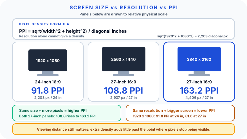
The three configurations below cover most desktop buying decisions. All are 16:9, so the pixel diagonal calculation is identical in form and only the numbers change.
| Display | Resolution | Diagonal pixels | Diagonal inches | PPI |
|---|---|---|---|---|
| 24-inch 1080p | 1920 x 1080 | 2,202.9 | 24 | 91.8 |
| 27-inch 1440p | 2560 x 1440 | 2,937.2 | 27 | 108.8 |
| 27-inch 4K | 3840 x 2160 | 4,405.8 | 27 | 163.2 |
Two separate effects are visible here.
Same size, more pixels raises density. The two 27-inch panels are physically identical. Moving from 1440p to 4K lifts density from about 109 to about 163 PPI, a 50% increase, because the same physical area is divided into more pixels.
Same resolution, bigger screen lowers density. Put that 1920 x 1080 grid on a 27-inch panel instead of a 24-inch one and the density falls from 91.8 to about 81.6 PPI. Nothing was lost; the same pixels are simply spread wider, so each one is physically larger.
Notice also that the jump from 24-inch 1080p to 27-inch 1440p is smaller than the resolution labels suggest. The pixel count rises by about 78%, but because the screen also grew, density only rises from roughly 92 to 109 PPI. Resolution increases that come with a size increase deliver much less added sharpness than the numbers imply.
Why the same resolution looks sharper on a smaller screen
Print makes the intuition concrete. Take one 1920 x 1080 image and produce it as a postcard and as a poster. The postcard is crisp because those pixels are packed into a few inches. The poster is soft up close because the same pixels have been stretched across a wall.
Displays behave the same way. A 5.5-inch phone panel at 1920 x 1080 lands around 400 PPI. A 24-inch monitor at the same resolution lands around 92 PPI. The pixel count is identical; the pixel size differs by more than four times.
This is not a verdict on the monitor. You sit much further from it, and it was chosen for working area rather than density. It simply explains why "same resolution" and "same sharpness" are different claims.
Viewing distance changes what density is worth
Perceived sharpness depends on the angle a pixel subtends at your eye, which means density and distance trade against each other. Doubling your distance from a screen has roughly the same effect on apparent pixel size as doubling its density.
That relationship is why the high-density marketing terms used for phones and laptops, of which Apple's "Retina" branding is the best known, are always framed around a typical viewing distance rather than a fixed PPI number. The underlying claim is about pixels being small enough not to be individually resolvable at the distance that class of device is normally used, so the density required is much higher for a phone held close than for a television watched from a sofa. Vendors define these thresholds themselves, and the figures vary by product and by manufacturer.
The practical consequences:
- A 55-inch television at around 80 PPI can look flawless from ten feet and coarse from two.
- A phone at 400 PPI is used at roughly a foot, where a monitor's 92 PPI would look obviously pixelated.
- Sitting further back from a monitor is a real, free alternative to buying more pixels, though it costs you apparent size.
Beyond the point where individual pixels are no longer resolvable at your normal distance, extra density stops improving perceived sharpness and starts costing performance and power instead.
Scaling: why more pixels does not mean more workspace
Operating systems draw the interface in logical units, not raw pixels, and multiply by a scaling factor to fill the panel. This is where high-resolution screens get confusing.
At 100% scaling on a 27-inch 4K monitor, everything is drawn at the physical pixel grid: enormous workspace, and text small enough that most people find it uncomfortable at normal desk distance. At 150%, the interface occupies the same apparent size as it would on a 1440p screen while being rendered with 1.5 times as many pixels in each direction. The result is smoother text and cleaner edges, with the same amount of usable working area as the 1440p panel, not more.
That is the trade to understand before buying: on a high-density display, extra pixels are usually spent on rendering quality, not extra room. If you want more room, a larger screen or a second monitor delivers it; if you want smoother rendering at the same room, more pixels do.
For design and front-end work, this splits into two different pixel concepts. CSS pixels are logical units that the browser maps onto physical device pixels using the device pixel ratio. A 44 CSS-pixel button is drawn with 88 physical pixels on a ratio-2 display, which is why it stays the same physical size while looking sharper. A dense phone therefore behaves like a narrow viewport, not like a tiny 4K monitor: it has many device pixels and few CSS pixels. The Pixel Converter is useful when translating between CSS sizes, rem values, and viewport units.
Aspect ratio changes shape, not sharpness
Aspect ratio is the proportion of width to height. It does not affect PPI directly, but it determines what a given diagonal buys you.
| Aspect ratio | Typical use | Effect at the same diagonal |
|---|---|---|
| 16:9 | Most monitors, TVs | The baseline shape |
| 16:10 | Many laptops, some monitors | Taller, more vertical room for documents and code |
| 3:2 | Some laptops and tablets | Taller still, closer to page proportions |
| 21:9 | Ultrawide monitors | Much wider, usually no extra vertical pixels |
A 16:10 laptop screen and a 16:9 laptop screen of the same diagonal give a noticeably different amount of vertical space, which matters far more for reading and writing than a small difference in density does. The Aspect Ratio Calculator handles the proportions when you are comparing shapes rather than densities.
Where PPI stops being useful
PPI is one number describing one property, and a display is many properties.
- It ignores viewing distance, which is at least as important as the density itself.
- It says nothing about image quality. Contrast ratio, colour accuracy and gamut, brightness, uniformity, and viewing angles are separate characteristics, and a high-density panel can be poor at all of them.
- It ignores motion. Refresh rate and response time matter for gaming and fast video and are unrelated to density.
- It cannot fix the content. A 900-pixel-wide image displayed across a 4K hero area is upscaled and looks soft no matter how dense the panel is. Text and vector icons redraw sharply at any density; bitmaps do not.
- It says nothing about ergonomics. Panel height, stand adjustment, and glare handling affect comfort more than a 15 PPI difference will.
The honest summary is that PPI answers exactly one question well: how finely is this panel divided. It is a useful input to a decision, not the decision.
Comparing across device classes
| Device | Resolution | Diagonal | Approximate PPI | Typical distance |
|---|---|---|---|---|
| Phone | 2340 x 1080 | 6.1 in | ~423 | About a foot |
| Laptop | 2560 x 1600 | 13.3 in | ~227 | Under two feet |
| Monitor | 1920 x 1080 | 24 in | ~92 | Two to three feet |
| Monitor | 2560 x 1440 | 27 in | ~109 | Two to three feet |
| Monitor | 3840 x 2160 | 27 in | ~163 | Two to three feet |
| Television | 3840 x 2160 | 55 in | ~80 | Six to ten feet |
These are illustrative configurations rather than specific products, and the densities fall as the viewing distance rises. That pattern is the point: devices are designed around the distance they are used at, so raw PPI comparisons between a phone and a television describe the use case more than the quality.
Practical guidance when comparing displays
- Get both numbers. Resolution without diagonal, or diagonal without resolution, cannot produce a density. A "4K" listing that omits the size has told you almost nothing.
- Decide whether you want room or refinement. More screen gives room. More pixels at the same size give refinement. They are separate purchases.
- Check the scaling you will actually use. Work out the effective workspace at your preferred scaling factor, not at 100%.
- Match density to distance. A monitor you sit close to justifies density that a television does not.
- Treat the density figure as a floor, not a ranking. Once a panel is dense enough for your distance, contrast, colour, refresh rate, and ergonomics decide which display is better.
Common mistakes
Using resolution as a synonym for sharpness. Resolution is a count; density is a count divided by physical size.
Assuming a 4K label describes sharpness. It describes pixel count only, and the same count spans 27-inch monitors and 65-inch televisions.
Comparing diagonals across aspect ratios. Same diagonal, different shape, different usable area.
Expecting a high-resolution screen to give more workspace. At the scaling most people use, the extra pixels buy rendering quality rather than room.
Ignoring distance. A density that is excellent for a phone is unnecessary for a television.
Confusing CSS pixels with device pixels. A dense phone has a narrow layout viewport, not a wide one.
Reviewing a design only from screenshots. A screenshot carries pixels but no physical size, scaling factor, or zoom level.
FAQ
What does screen size mean? The physical diagonal measurement of the panel, corner to corner. A 24-inch 16:9 monitor is about 20.9 inches wide and 11.8 inches tall.
What is PPI and how do I calculate it? PPI is pixels per inch of physical screen. Take the square root of (width squared plus height squared) to get the diagonal in pixels, then divide by the diagonal in inches. For 1920 x 1080 on 24 inches: sqrt(1920^2 + 1080^2) = 2,202.9, divided by 24 gives about 91.8 PPI.
Why can two screens with the same resolution look different? Because density depends on physical size as well as pixel count. The same 1920 x 1080 grid is about 400 PPI on a 5.5-inch phone and about 92 PPI on a 24-inch monitor.
Does higher resolution always mean sharper? Not on its own. Sharpness depends on density and viewing distance together. A higher resolution spread over a much larger screen can be less dense than a lower resolution on a small one, and beyond the point where pixels are no longer individually resolvable at your distance, extra density stops being visible.
Is 1440p or 4K better for a 27-inch monitor? They serve different priorities. At 27 inches, 1440p gives about 109 PPI and usually runs at 100% scaling with plenty of workspace and lower performance demands. 4K gives about 163 PPI and noticeably smoother text, but most people run it scaled, which means similar usable workspace with better rendering, at a higher cost in price and graphics load.
How does scaling affect readability? Scaling sets how large interface elements are drawn relative to the pixel grid. Without it, a high-density screen renders text uncomfortably small. With it, text stays a comfortable size and the extra pixels go into smoother edges instead of extra workspace.
Why does a phone look sharper than a laptop? Phones pack far more pixels per inch, often above 400 PPI against roughly 100 to 230 for laptops, because they are held much closer to the eye and need that density to keep pixels invisible at that distance.
Is PPI the same as DPI? They are used interchangeably in casual conversation, but PPI conventionally describes screens and DPI describes printing and print output devices.